|
|
Post by munterbaconsims on May 3, 2015 1:10:25 GMT -5
I've been working on some gradient tints for windows and this is what I've come up with so far:  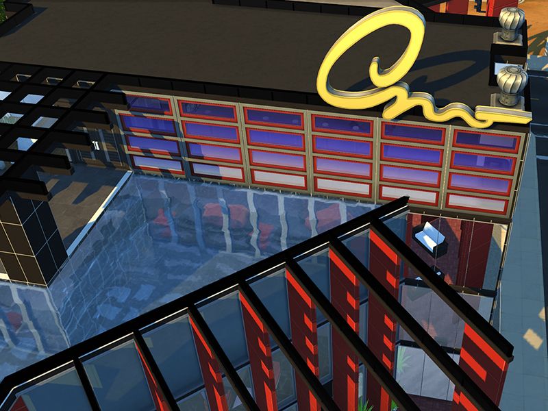 The top one has a pure white alpha level, so the glass cannot be seen through on either side. Whereas the bottom image has a touch of grey added to the alpha, so the glass has some transparency to it. I might try other gradient combos to see how they look and post them here too, but I would appreciate any feedback on my noob creation =) Cheers, Munterbacon |
|
|
|
Post by simzfanatik on May 4, 2015 10:07:07 GMT -5
This is interesting, I don't think I've seen windows done like this before. I like the privacy aspect of the ones in the top and the transparent glass is very realistic looking! How do they look from the inside with respect to how much light is let through, I'm curious. I'd definitely download and use these in my games.
Different gradients would really bring some great looks to buildings, very unique!
Great job on these, can't see what else you come up with!
|
|
|
|
Post by munterbaconsims on May 4, 2015 22:32:43 GMT -5
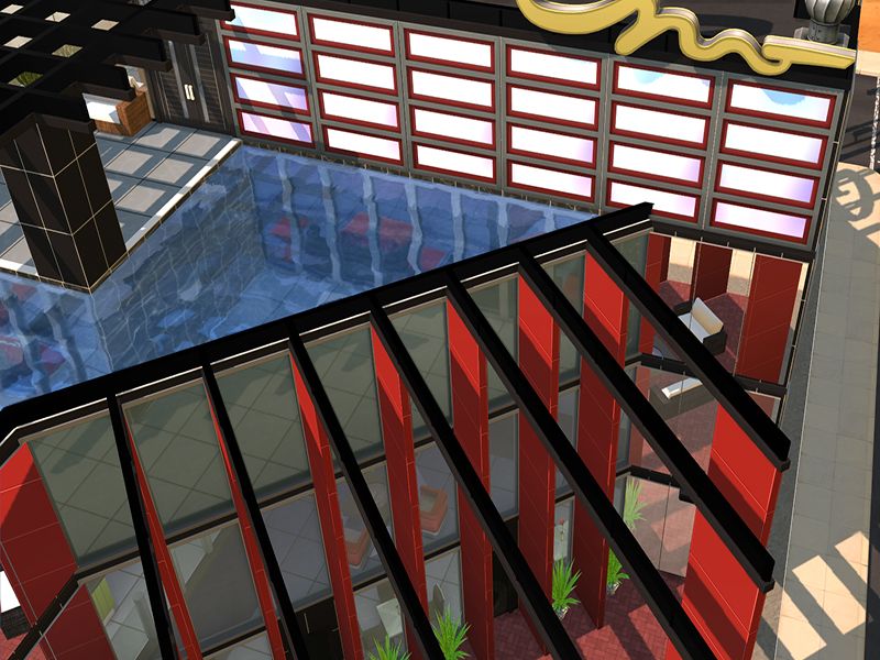
Thank you Simzfanatik! Using the same building I took some unedited screenshots of the interior. The top one is my Blue Gradient Tint. It let's in a good amount of light but not too much which I like. The bottom one is just the standard window that comes with the base-game for reference. I'm juggling projects at the moment. Trying to completed a followers gift for Tumblr, and those tiles you see in the screenshot are mine too. Trying to rework the Klassy Large-Format Tiles with a darker, contrasting seam. Once the gift is done I'll try tackling the windows again and see what I can do.  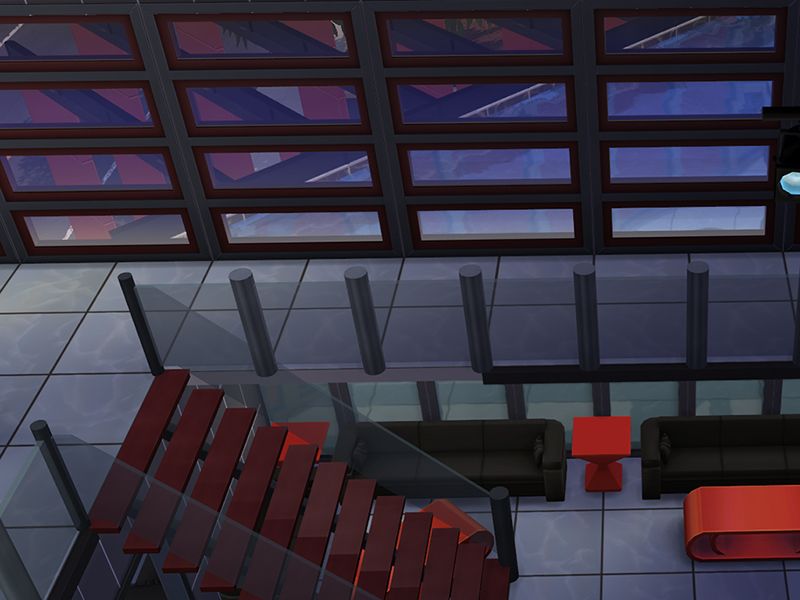 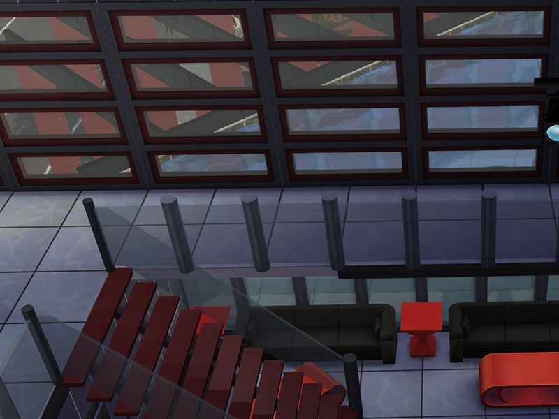 |
|
|
|
Post by orangemittens on May 5, 2015 1:23:37 GMT -5
The tinted windows look really cool munterbaconsims...great idea  |
|
|
|
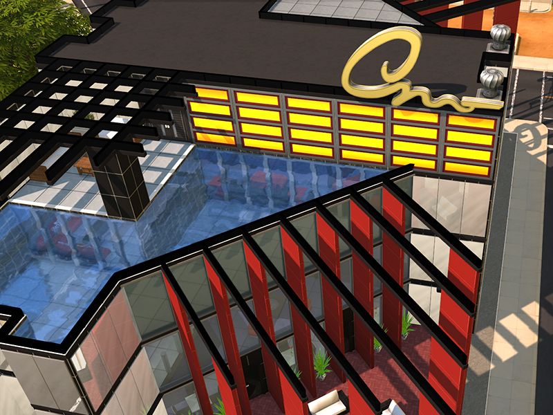
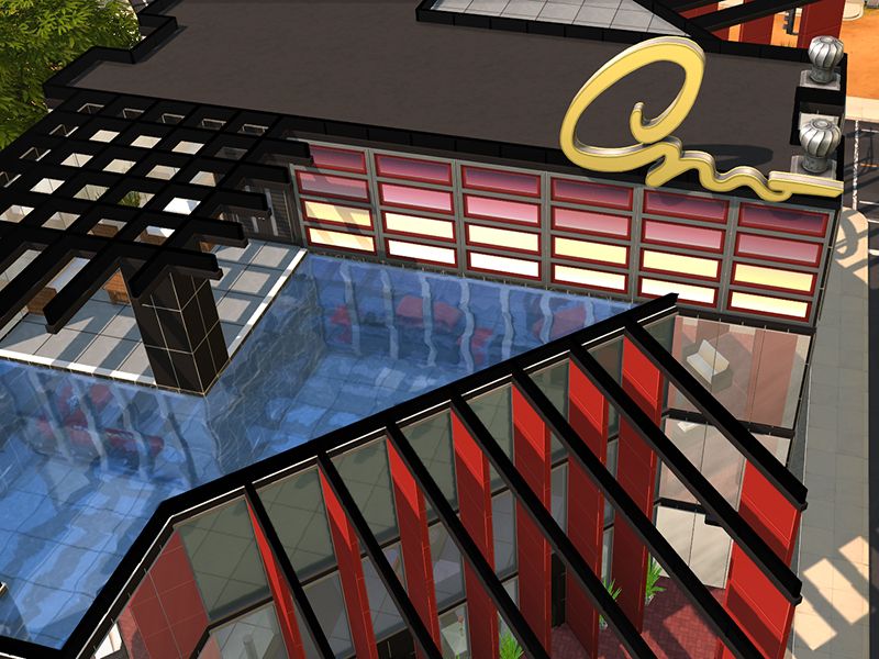
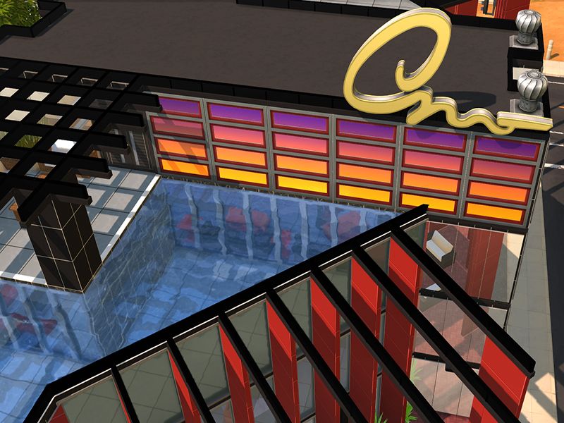
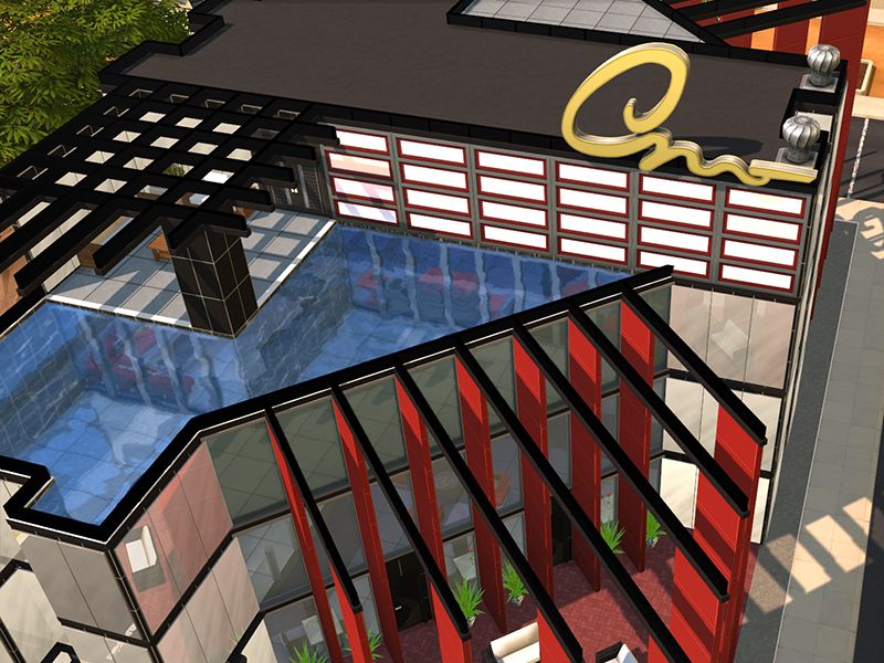
Post by munterbaconsims on May 7, 2015 0:50:15 GMT -5
Tried a few more colour options for the Pure White Alpha version (I'm calling it the "No Peeking" range). Greenstone:

I like this one. Just because... Sunburst:
I dunno, I like it but it is REALLY bright. The transparent version may look better. Wine:
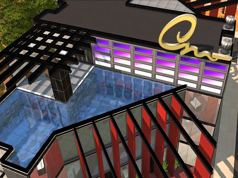
This one was my least favourite in S4S but looks great in game and may be one of my favs, go figure? Violet Sunset:
I really like this one, it really pops! Can't wait to see what the transparent version looks like! Rainbow Mist:
Rainbow mist is subtle, not very noticeable when the sun is shining at it from the outside, apart from when shadows are cast against it like in the far left window. On the inside the rainbow pattern is noticeable. I like them all in their own way. Not sure if I will keep it at that or try some other variations. But I'll try the transparent version either later this evening or tomorrow some time. |
|
|
|
Post by munterbaconsims on May 8, 2015 6:01:30 GMT -5
4 more tints added to the "No Peeking" range. Submarine: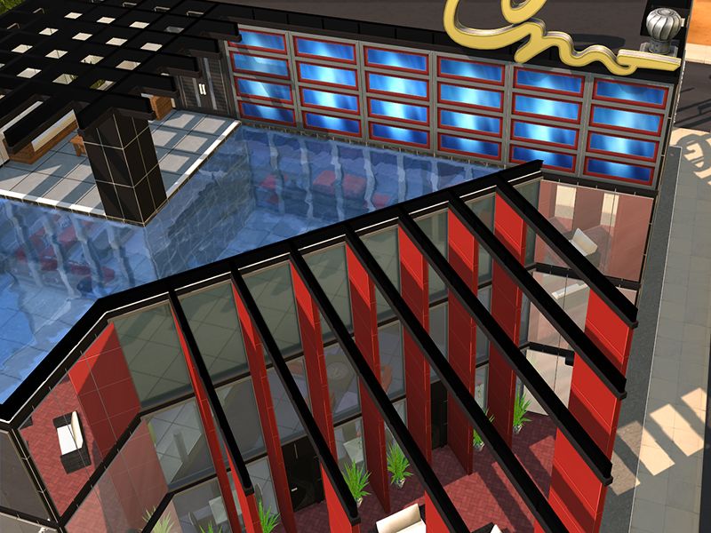 Meh, I dunno. Might pull this one from the list. We'll see how it looks with transparency or with other windows. Northern Lights:
This one looked different to the other rainbow one but turned out mostly similar. It is more noticeable under the sunlight though. Electric Plum:
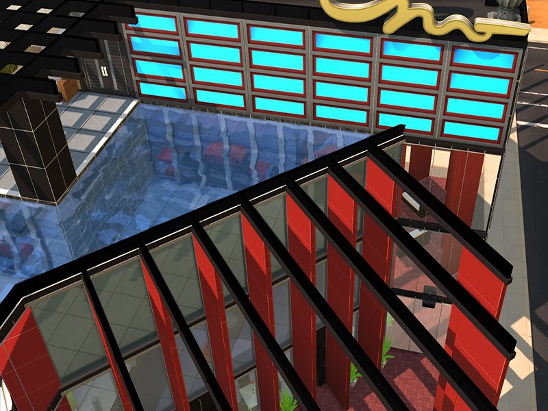
This one I put the gradient on an angle and I like the effect. Will probably look good with some transparency to it too. Clear Skies:
Oohhh... Pretty!!! So that's it, 10 tints in total - with one possibly getting pulled. Now time to work on the transparency version and also see how they look in other windows. |
|
|
|
Post by munterbaconsims on May 9, 2015 0:24:08 GMT -5
Ok, I've done the transparency ones in those 10 tints. To save space, I've split the screenshots into 4 (2 tints per picture, with interior/exterior view). 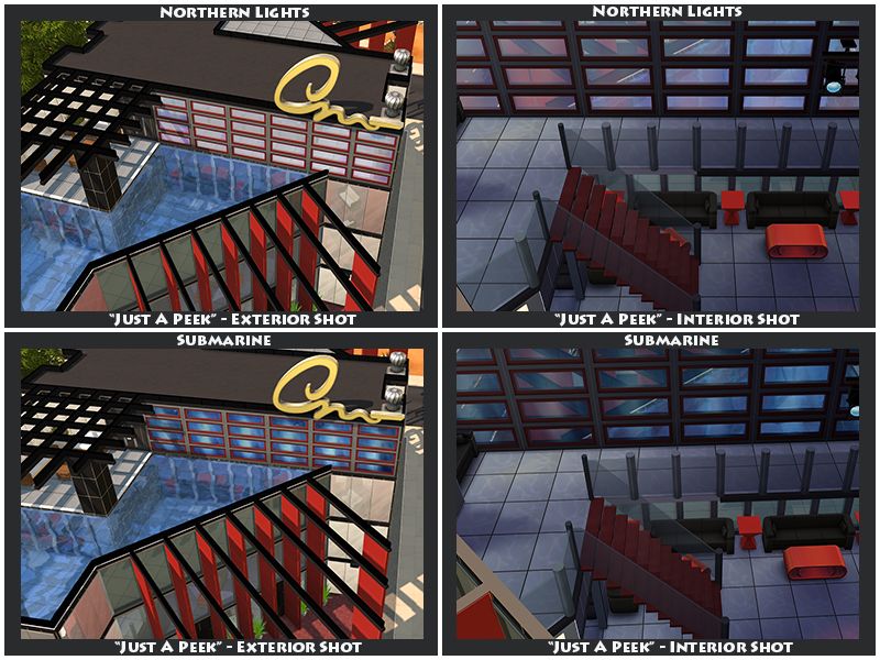 Still not sure about Submarine, it looks better with a bit of transparency but I don't know. This one will most probably get cut. Northern Lights is cool, it is very similar to Rainbow Mist (just more noticeable). 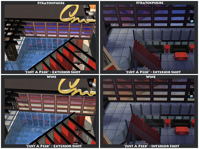 Wine looks cool the way the two-tone gradient reacts to a greyer alpha. I really like this one. 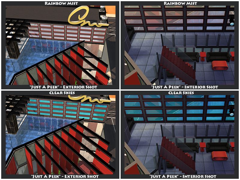 See, Rainbow Mist is very similar to Northern Lights. As this one isn't as noticeable I may cut this from the WIP. Clear Skies looks good tho, keeping that one. 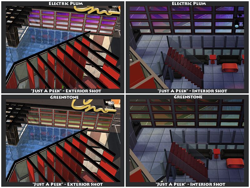 Love these two. 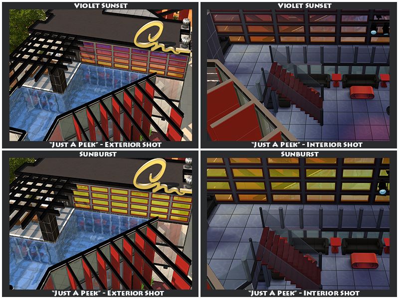 Violet Sunset is by far my favourite. And Sunburst actually looks really nice here, so even though I'm not 100% convinced about it in the "No Peeking" version, I'll keep it. Well that's it. Now I've got to figure out what to do next, do it in one massive project (recolouring each window and door) before releasing it, or releasing it a tint at a time. |
|
|
|
Post by ajOya on May 12, 2015 14:49:47 GMT -5
Oh! This is so lovely! ♥
|
|
|
|
Post by munterbaconsims on May 20, 2015 1:56:26 GMT -5
Oh I just spotted this now, thank you! Not long to go and I'll be posting the completed project on to Tumblr. Looks really good on the two buildings I've used them on so far: High-End Bar: Showcasing "Northern Lights" in "Just A Peek" style.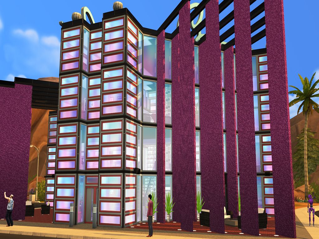 Alien Lot - Showcasing "Clear Skies" in both "No Peeking" and "Just A Peek" styles. Alien Lot - Showcasing "Clear Skies" in both "No Peeking" and "Just A Peek" styles.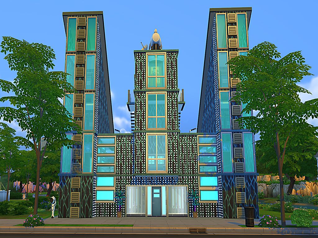 I chuck a link to my tumblr page in the CC Links threasd when it's up =) |
|
|
|
Post by munterbaconsims on May 21, 2015 22:21:48 GMT -5
Now that the windows are done I'm on to the next thing. Which is trying to make a nanosuit for my warrior alien.I used one of the tops from the luxury party stuff pack as a base for the carapace. I didn't account for the shininess on the sides and back panels but I don't mind it, I think it looks good with the plasma. Still a lot of work to do and may not be the finished texture but here's a quick screenshot of Shaela wearing her plasma-carapace and nano-weave undershirt. 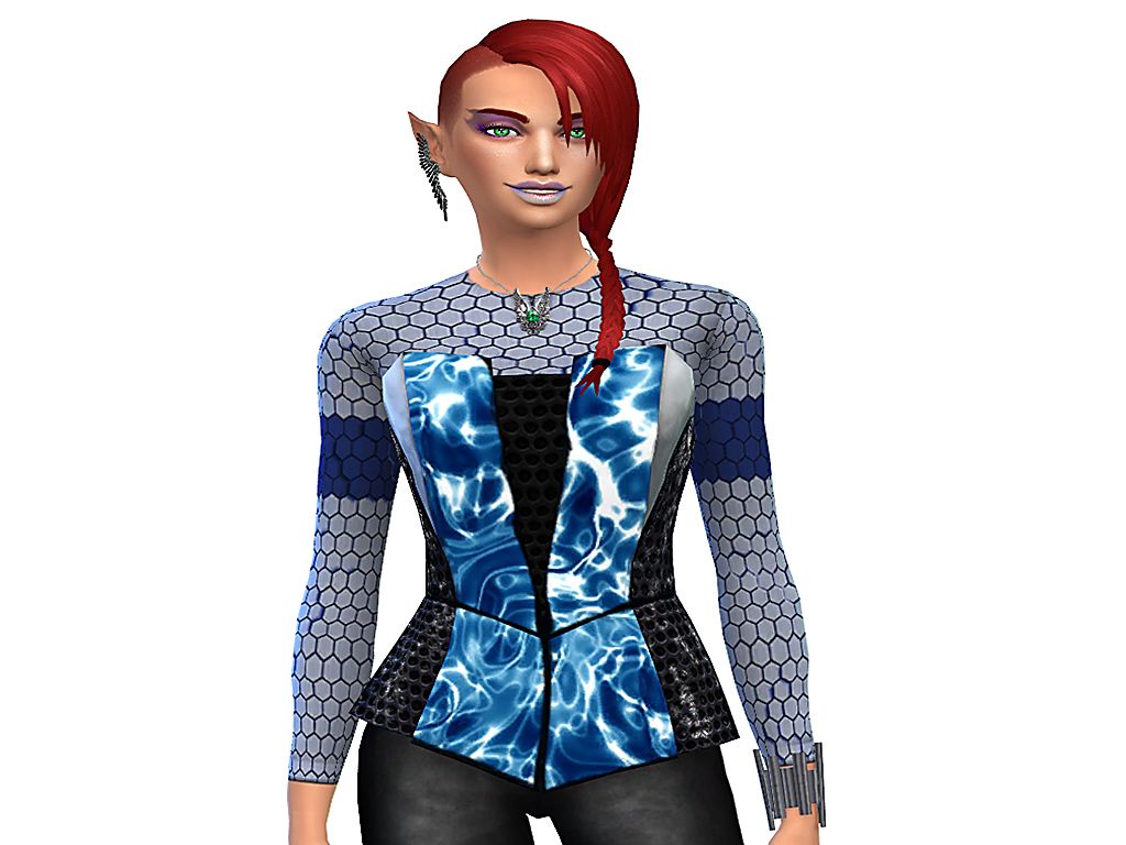 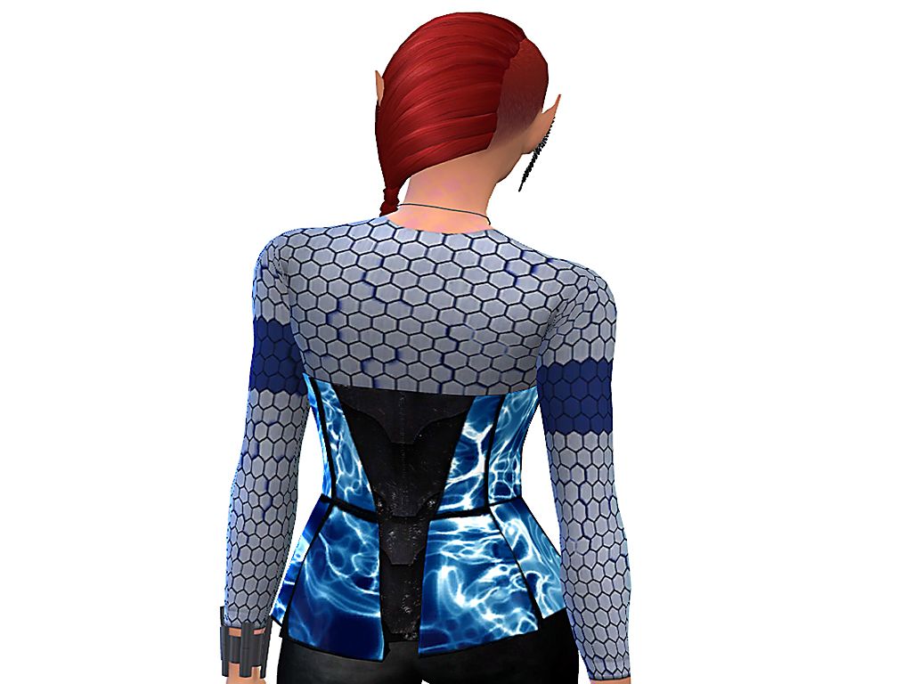 Need to edit the bump map (when I figure out how to that is) on the back panel, still showing the zip. And maybe give the undershirt hexagons some height. |
|
|
|
Post by munterbaconsims on May 22, 2015 3:49:54 GMT -5
Decided to use something else as the base for Shaela's suit. I used saikyoc4's zero-suit as the base. Pleased so far, just got to find the other textures I want to use and edit the bump map. This one will probably be just for personal use (who knows, may release it if I'm happy with the end result).  |
|
|
|
Post by simour on May 22, 2015 11:09:36 GMT -5
I really love the windows and the texture for the suit is really coming along.
|
|
|
|
Post by munterbaconsims on May 23, 2015 0:49:46 GMT -5
I really love the windows and the texture for the suit is really coming along. Thank you! Worked a bit more on the suit, added a texture to the black parts (which I scrapped because I didn't like it). Then lengthened the back plating and added some connectors onto it. Considering using the same texture for the connectors, adding more further down the back, (maybe smaller) and possibly tiny ones running down the spine, we'll see. 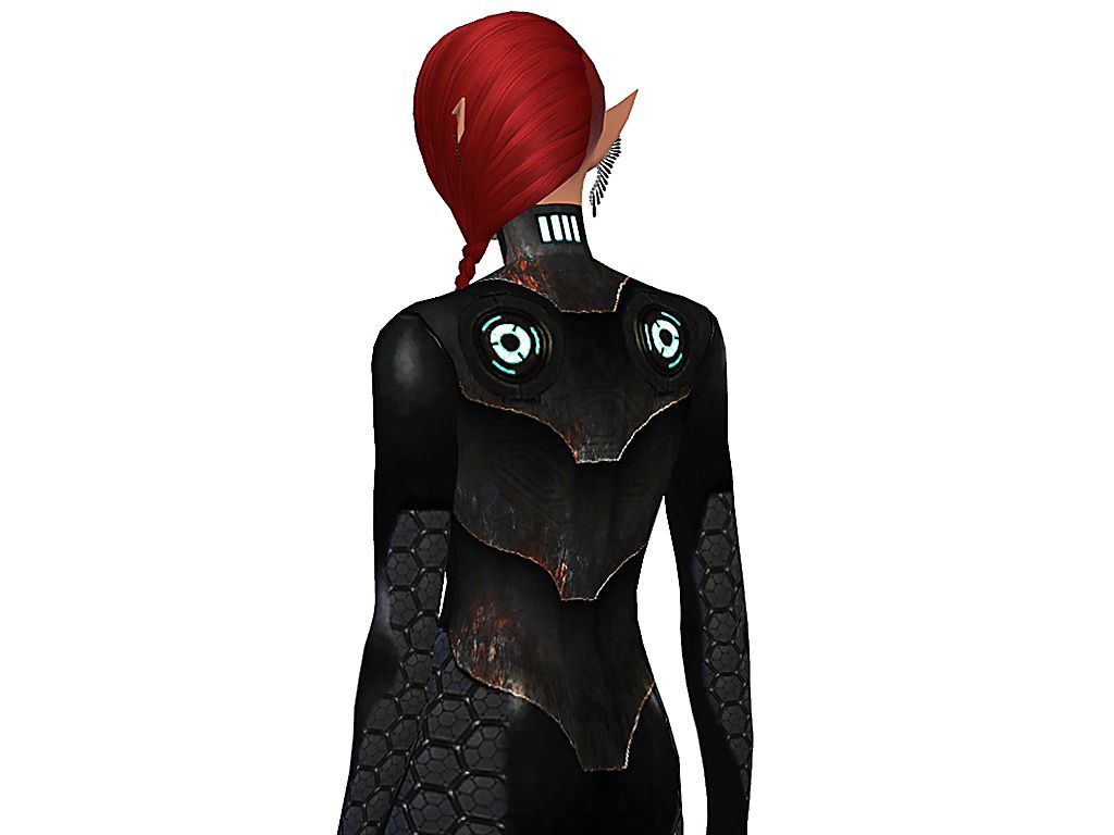 |
|
|
|
Post by orangemittens on May 23, 2015 1:27:19 GMT -5
The suit is looking really great  |
|
|
|
Post by munterbaconsims on May 24, 2015 12:22:05 GMT -5
The suit is looking really great Thank you orangemittens! Got distracted today, when I realised that the suit didn't have a helmet! I ended up making an assassin/ninja hood out of the base-game hood and the face-masks that black-le created. I layered the masks to give it a sort of "old school Shredder" look, but it's pretty poorly done as my blender skills are not good. But as it'll be for personal use I'm fine with it. I'll continue to tinker with it and if I get it to a stage where I'm happy with it I'll ask if black-le would be cool with me uploading it. As for the suit, it's coming along nicely. Added more connectors to the back (4 smaller diagonally facing ones on the next plate down, and 8 even smaller ones running down the spine). I think it looks really good. I had teeny tiny ones on each knuckle on the hands but they didn't look so good so I pulled them. By accident I found out that the same overlapping armour that I had on the back looked great on the front, with a bit of doctoring I think it came out looking really nice. Now I've got to decide if I'm going to colour the black parts with a texture or leave as is. 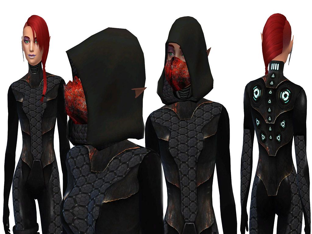 |
|